How to Visualize Qualitative Data for Actionable Insights

- 2024-05-18
How to Visualize Qualitative Data for Actionable Insights
The Challenge of Unseen Insights: Why Visualize Qualitative Data?
Qualitative research yields rich, nuanced data in the form of interview transcripts, focus group discussions, open-ended survey responses, and observational notes. While incredibly valuable, this wealth of textual information can be overwhelming. The core challenge lies in transforming these extensive datasets into clear, digestible, and actionable insights that can drive informed decisions. This is where qualitative data visualization becomes an indispensable tool for researchers, analysts, and strategists alike.
Visualizing qualitative data is not merely about making findings aesthetically pleasing; it's a powerful analytical process that enhances understanding, facilitates communication, and amplifies the impact of your research. Effective visualizations can illuminate patterns, highlight key themes, and tell compelling stories that might remain buried in pages of text. By translating complex qualitative findings into accessible visual formats, you can engage a wider audience, foster deeper comprehension, and ensure your research translates into tangible actions. This guide explores how to effectively visualize qualitative data, with a special focus on how platforms like Leapfrog can streamline this process and help you unlock the full potential of your research.
What Exactly is Qualitative Data Visualization?
Qualitative Data Visualization is the art and science of representing non-numerical data—such as text, audio, and images—in a graphical or pictorial format. Unlike quantitative visualization, which deals with numbers and statistics, qualitative visualization aims to reveal patterns, themes, relationships, and narratives within unstructured data. The goal is to provide a clear, concise, and engaging summary of findings that can be easily understood and acted upon.
The importance of this practice cannot be overstated. Visuals are processed significantly faster by the human brain than text, making complex information more accessible and memorable. In a research context, this means that well-designed visualizations can:
- Enhance Clarity: Simplify complex information and make intricate relationships between concepts easier to grasp.
- Improve Engagement: Capture and hold the attention of your audience, whether they are stakeholders, clients, or team members.
- Facilitate Deeper Understanding: Allow viewers to see the bigger picture and identify underlying themes or outliers more readily.
- Drive Action: Present insights in a compelling way that motivates decision-makers to act on the research findings.
- Promote Collaboration: Provide a shared visual language that can help teams align on insights and next steps.
Key Techniques for Visualizing Qualitative Data
Several techniques can be employed to visualize qualitative data effectively, each suited to different types of data and communication goals.
1. Thematic Maps & Concept Maps
Thematic maps or concept maps are excellent for illustrating the relationships between different themes, concepts, or codes identified in your qualitative data. These visualizations typically use nodes (representing concepts) and links (representing relationships) to create a visual web of insights. They are particularly useful for showing the hierarchy and interconnectedness of themes that emerge from methods like thematic analysis or affinity diagramming. Platforms like Leapfrog, with its Canvas feature, allow for dynamic organization of data that can form the basis of such maps, helping to visually cluster related ideas.
2. Customer Journey Maps
When your research focuses on user experience or processes, a customer journey map can be a powerful visualization. This technique maps out the various stages a user goes through when interacting with a product, service, or system, highlighting their actions, thoughts, emotions, and pain points at each step. Qualitative data, such as quotes or observed behaviors, can be integrated into the journey map to provide rich context.
3. Word Clouds & Text Summaries
Word clouds visually represent the frequency of words within a text, with more frequent words appearing larger. While they can offer a quick, high-level glimpse of prominent terms, they often lack the nuance needed for deep qualitative insights and can sometimes be misleading if not interpreted with caution. More sophisticated text summaries, potentially AI-generated (as with Leapfrog's AI Chat), can provide a more coherent textual overview that can then be complemented with other visual forms.
4. Quote Cards & Evocative Visuals
Extracting impactful quotes and presenting them as visually engaging "quote cards" can be a simple yet powerful way to convey key sentiments or experiences from your participants. These can be particularly effective in presentations or reports to add a human element and make findings more memorable. These often work best when paired with relevant imagery or icons.
5. Qualitative Charts & Graphs
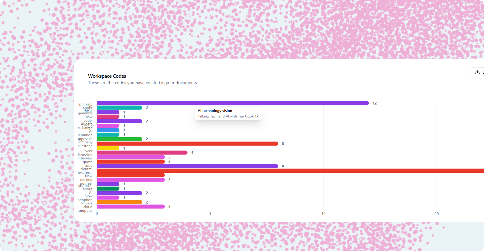
While often associated with quantitative data, certain charts can be adapted for qualitative insights. For example, a horizontal bar chart can clearly display the frequency of different codes or themes across your dataset, making it easy to spot which topics are most prevalent.
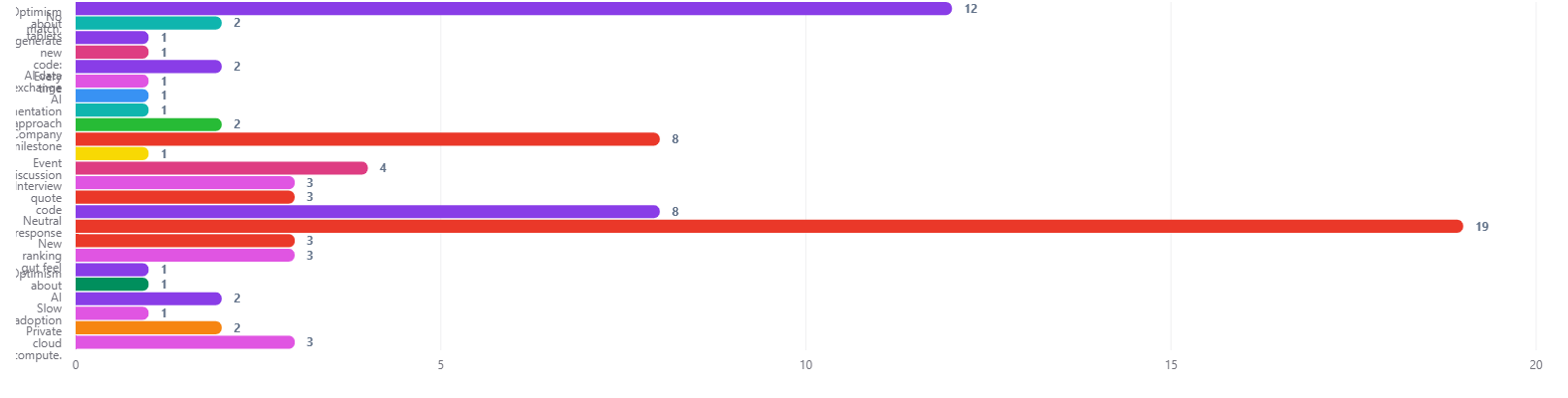 A bar chart showing the frequency of qualitative codes can quickly highlight dominant themes in your research.
Pie charts can provide a quick, intuitive sense of the proportion of each theme in your data, especially when there are only a few categories. However, for more detailed comparison or when dealing with many codes, bar charts or treemaps are often more effective. Pie charts can sometimes make it difficult to compare the size of categories, particularly when there are many segments or subtle differences.
 A pie chart can show the relative proportion of each code, but be cautious when using it for complex qualitative data.
Treemaps are particularly useful for visualizing hierarchical relationships or the relative size of many categories at once. Each rectangle's size represents the frequency or importance of a code, and related codes can be grouped visually.
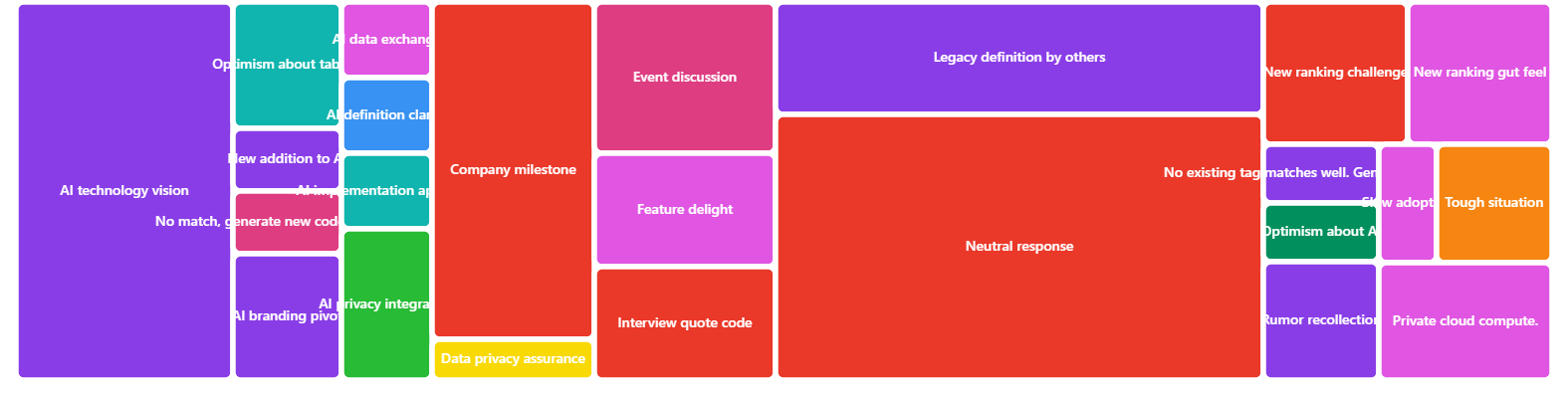 A treemap can help you see both the hierarchy and the relative prominence of codes in your qualitative dataset.
6. Dashboards: A Holistic View
A research dashboard can bring together multiple visualizations into a single, interactive view, providing a comprehensive overview of your qualitative findings. This could include key themes, illustrative quotes, user personas, and charts showing code frequencies. Dashboards are excellent for presenting a multifaceted story to stakeholders.
From Raw Data to Visual Story: A Step-by-Step Guide
Transforming your qualitative data into compelling visualizations involves a systematic process.
Step 1: Organize and Code Your Data
Before you can visualize anything, your data needs to be organized. This typically involves transcribing interviews, and then coding or tagging the data to identify key themes, concepts, and patterns. As detailed in our companion article on Clustering and Tagging in Qualitative Research, this foundational step is crucial. Tools like Leapfrog streamline this with AI-assisted coding and thematic clustering.
Step 2: Identify Key Insights and Narratives
Once your data is coded and themes are emerging, pinpoint the most significant insights and the core story you want to tell. What are the "aha!" moments? What findings will be most impactful for your audience? Not all data needs to be visualized; focus on what truly matters.
Step 3: Choose the Right Visualization Technique
Consider your data, your audience, and your communication goals. Are you trying to show relationships between themes? (Use a concept map). Illustrate a process? (A journey map). Highlight key participant voices? (Quote cards). Select the visualization type that will convey your message most effectively.
Step 4: Design for Clarity, Simplicity, and Impact
Good visualization is good communication. Aim for:
- Clarity: The meaning should be immediately apparent. Avoid clutter and unnecessary jargon.
- Simplicity: Don't try to cram too much information into a single visual. Use whitespace effectively.
- Accuracy: Ensure your visuals faithfully represent your data and insights.
- Aesthetics: While secondary to clarity, a visually appealing design can enhance engagement. Use color, typography, and imagery thoughtfully.
Step 5: Add Context and Narrative
Visualizations rarely stand alone. Accompany them with brief explanations, annotations, or a narrative that guides the viewer through the insights. Tell the story behind the data.
Leapfrog: Your Partner in Visualizing Qualitative Insights
Leapfrog is designed not just for data analysis but also for transforming that analysis into actionable, visual insights.
Visual Organization on the Canvas
Leapfrog's Canvas provides a dynamic, interactive space where you can visually organize your coded data, notes, and multimedia. This acts as a powerful precursor to formal visualization. You can drag and drop elements, create affinity diagrams, and see relationships emerge. This visual clustering helps in understanding the structure of your data, which is essential for effective visualization.
Generating Charts and Reports with Analytics
The Analytics module in Leapfrog allows you to create various charts and reports directly from your coded and tagged data. You can visualize the frequency of themes, compare data across different participant segments, or track sentiment. These built-in tools save you from manually exporting data to create basic visualizations elsewhere.
AI-Powered Summaries for Visual Storytelling
Leapfrog's AI Chat feature can help synthesize large amounts of textual data into concise summaries or identify key quotes related to specific themes. These AI-generated outputs can then serve as the textual component of your visualizations or inform the narrative you build around them, ensuring your visual story is grounded in comprehensive analysis.
From Synthesis to Presentation
Leapfrog supports the entire journey from raw data to presentation-ready insights. By facilitating robust coding, AI-powered thematic clustering, and integrated analytics, it ensures that the insights you choose to visualize are well-founded. The platform makes it easier to identify the core narratives that can be powerfully conveyed through visual means.
Best Practices for Impactful Qualitative Data Visualization
- Know Your Audience: Tailor your visualizations to their level of familiarity with the research and their information needs.
- Focus on Storytelling: Use your visuals to tell a clear and compelling story about your findings.
- Maintain Context: Always provide enough context for the viewer to understand what the visualization represents and why it's important.
- Iterate and Get Feedback: Don't expect to create the perfect visual on the first try. Sketch, prototype, and get feedback from colleagues or stakeholders.
- Ensure Ethical Representation: Be mindful of how you represent participant data, ensuring anonymity and avoiding misinterpretation.
- Integrate with Your Report: Visualizations should be seamlessly integrated into your research report or presentation, supporting the overall narrative.
Conclusion: Illuminating the Path to Action
Visualizing qualitative data is a critical skill for any researcher aiming to make a real impact. It transforms rich, complex narratives into clear, engaging, and actionable insights. By thoughtfully selecting visualization techniques and leveraging the capabilities of modern research platforms like Leapfrog, you can ensure your findings resonate with your audience and drive meaningful change. The journey from raw text to compelling visual story is an art form that, when mastered, elevates the value and influence of your qualitative research.
Frequently Asked Questions (FAQ)
What is the main goal of visualizing qualitative data? The primary goal is to make complex qualitative findings more accessible, understandable, and actionable. Visualization helps to reveal patterns, communicate key themes effectively, and engage audiences in a way that raw text often cannot, ultimately facilitating better decision-making.
How is visualizing qualitative data different from quantitative data? Quantitative data visualization focuses on representing numerical data through charts, graphs, and statistical models to show trends, correlations, and distributions. Qualitative data visualization aims to represent non-numerical data (text, audio, images) to illustrate themes, relationships, narratives, and experiences, often requiring more interpretive and creative approaches.
What are some common mistakes to avoid when visualizing qualitative data? Common pitfalls include: over-cluttering visuals with too much information; choosing inappropriate visualization types for the data or insight; lack of a clear narrative or takeaway message; misrepresenting data or creating misleading visuals; and focusing too much on aesthetics at the expense of clarity and accuracy.
How can Leapfrog specifically help me visualize my qualitative research findings? Leapfrog assists through several features: its Canvas allows for visual organization and affinity mapping of coded data; its Analytics module can generate charts and reports from your themes and codes; and its AI Chat can provide summaries and key quotes that inform your visual storytelling. It streamlines the process from data collection and coding to insight generation, which is the foundation for effective visualization.
Can I use traditional charts like bar graphs for qualitative data? Yes, but with a clear purpose. For instance, after coding your qualitative data, you can use a bar chart to show the frequency of different codes or themes, or to compare the occurrence of themes across different participant groups. The key is that the chart should illuminate a qualitative insight, not just present numbers without context.
What's more important: the visual appeal or the clarity of the information? Clarity of information is paramount. While an aesthetically pleasing design can enhance engagement, a beautiful visual that is confusing or misrepresents the data is counterproductive. The primary goal is to communicate insights effectively; aesthetics should support, not overshadow, this goal.